
Why Measuring UX Success Is Trickier Than It Looks
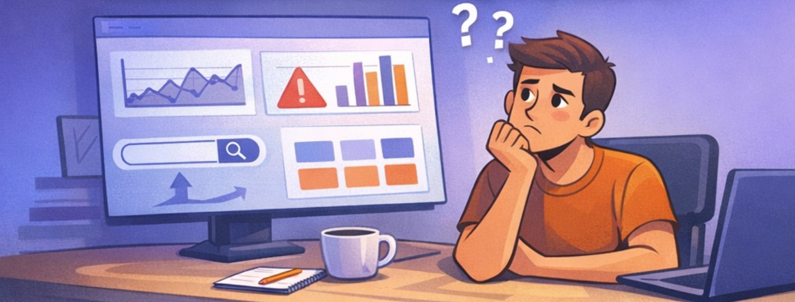
One of the trickiest parts of designing features isn't sketching screens or running research—it's figuring out how to measure if the thing we just built actually worked.
And that’s not as easy as it sounds.
I've worked on a few features where the metrics looked good, but something felt off. Other times, we almost killed a feature before it had a chance to prove itself—just because we were looking at the wrong numbers.
Here are a few real lessons I’ve learned (sometimes the hard way) when it comes to picking the right metrics for UX.
1. It's hard to know if this feature caused that result
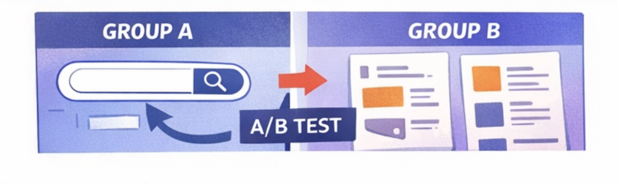
I was working on a search feature—seemed like a no-brainer. People couldn’t find what they wanted, so… add search, right?
But our product manager raised a concern:
“In previous data, users who used search actually converted less. What if it hurts our numbers?”
We weren’t sure if it was correlation or causation. Maybe search users were already struggling. Maybe the flow was too distracting.
Also, measuring success purely by overall conversion would have been misleading. Too many variables were involved: onboarding changes, pricing experiments, content updates.
Bottom line: we couldn't rely on old metrics to judge a new feature.
So we went with an A/B test:
Group A got the search
Group B didn’t
Only then could we see the actual impact, without guessing. That test ended up giving us way more confidence than debating analytics dashboards.
Takeaway:
Don’t assume. Test it properly. Otherwise, you're just gambling with data.
2. High usage doesn’t always mean success
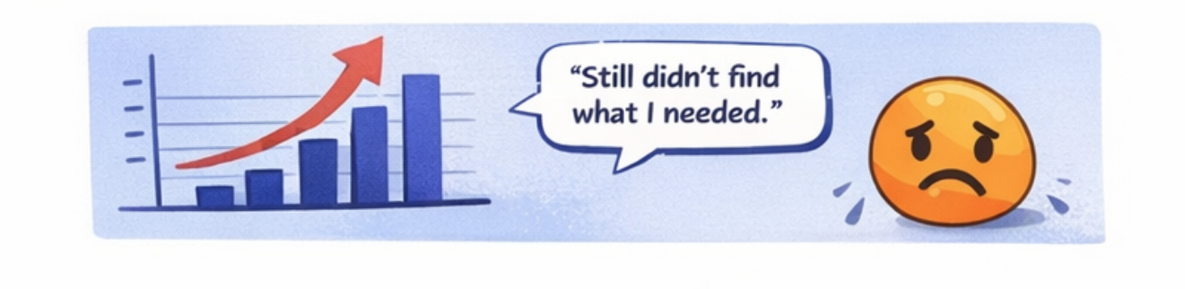
There was another time I worked on a feature where the product team wanted to measure success by how often it was used.
Makes sense, right? People using the feature = feature is good?
Not always.
Sometimes people use a feature a lot because it’s confusing.
Or because they can’t find what they actually need.
Or because they’re just poking around, unsure what to do next.
I’ve seen features with tons of clicks… that were actually making things worse.
What matters more:
Did it help them achieve their goal?
Did they finish what they came to do, or just get stuck in a loop?
Activity ≠ success.
Behavior ≠ satisfaction.
Clicks ≠ value.
Takeaway:
Measure what matters, not just what’s easy to track.
3. Some features take time to prove their worth
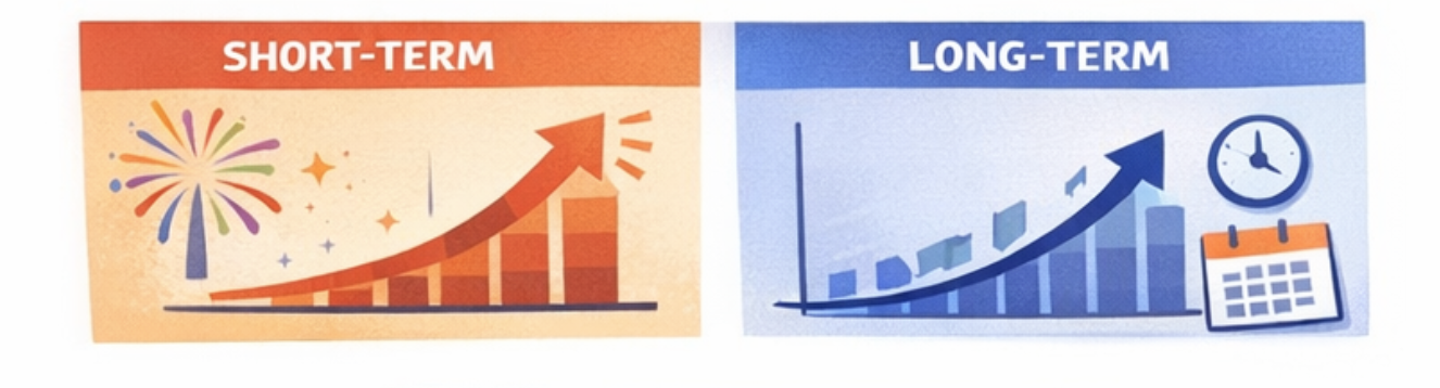
This one’s huge.
Not all features show their value right away. Some are meant to create long-term habits, or help people build trust over time.
Things like:
Progress trackers
Streaks
Saved content
Learning stats
If you judge them by 3-day usage or next-day retention, they’ll look like a failure. But that’s not what they’re built for.
I’ve seen features get labeled “not useful” because someone looked at the wrong timeframe.
Takeaway:
Ask yourself—is this feature meant to help right now, or over time?
Then pick your metric window accordingly.
What I do now (and recommend to others)
Before launch, I now try to get the team aligned on three questions:
What’s the actual problem we’re solving?
How will we know the user is getting value, not just clicking stuff?
Is this feature about instant payoff or long-term impact?
Only after that do we talk metrics.
Because once you know why the feature exists, it's much easier to figure out how to measure whether it's working.
Final thought
The right feature, measured the wrong way, can look like a failure.
And a broken feature, measured the wrong way, can look like a win.
So if you're ever looking at your analytics and thinking,
“Something doesn’t feel right…”
...trust that instinct.
Numbers need context. And designers can help give them that.