How I Decide What’s Worth Testing in UX Design
During my career as a product designer, I struggled with a recurring question:
What parts of a design truly need testing — and what can safely rely on design patterns and best practices?
Sometimes I’d lean heavily on conventions and proven patterns. Other times, I’d feel unsure and test everything “just to be safe.” And then came the sign-off meetings.
A stakeholder would ask:
“Did we test this flow?”
or
“Are we confident users understand this interaction?”
And honestly — I didn’t always know how to answer.
That uncertainty pushed me to rethink how I approach testing.
The Real Problem: Testing Everything Isn’t Practical
In theory, everything should be tested.
In reality, time, budget, and access to users are limited.
Over-testing slows teams down.
Under-testing creates risk.
What I needed wasn’t more testing — but a clear way to decide what deserves it.
A Simple Framework That Changed My Approach
Over time, I developed a simple but effective framework to decide what to test and how much confidence I can have without testing.
I call it the:
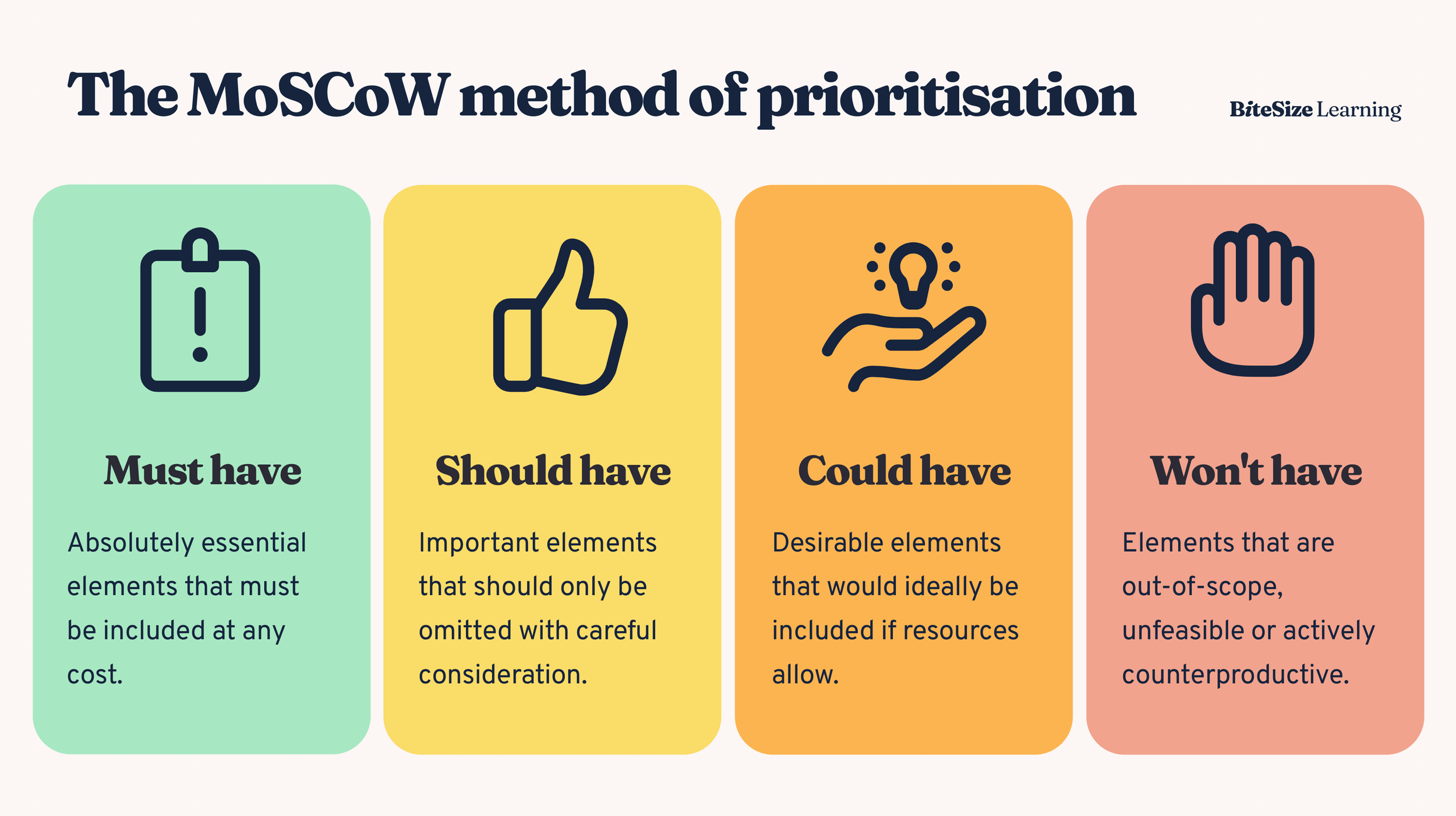
Must / Should / Maybe Test Framework
This framework helps me:
Prioritize testing effort
Explain decisions clearly to stakeholders
Defend design choices with confidence
1. Must Test: High Risk, High Impact
These are the areas I always push to test.
Must test if the design:
Introduces a new or unfamiliar interaction
Is critical to conversion, revenue, or retention
Has serious consequences if misunderstood
Examples:
Checkout or payment flows
Onboarding that blocks user access
Destructive actions (delete, cancel, unsubscribe)
Here, best practices are not enough. Real user feedback is non-negotiable.
2. Should Test: Medium Risk, Some Uncertainty
These are areas where patterns exist — but context matters.
Should test if the design:
Combines multiple known patterns in a new way
Targets a new user segment
Has multiple possible interpretations
Examples:
Filtering and sorting logic
Empty states with strong calls-to-action
Complex forms
If time allows, I test.
If not, I validate through reviews, heuristics, or quick internal checks — and I’m transparent about it.
3. Maybe Test: Low Risk, High Confidence
These are areas where testing adds little value.
Maybe test if the design:
Uses well-established design patterns
Has low impact if misunderstood
Is purely cosmetic
Examples:
Button placement following conventions
Standard input fields
Minor visual adjustments
Icon choices with labels
Here, best practices + design systems + experience are usually enough.
How This Helped in Stakeholder Conversations
Now, when someone asks:
“Did we test this?”
I don’t panic.
I can say:
“This fell into our ‘Should test’ category. We didn’t run user testing due to time constraints, but we validated it using proven patterns and cross-functional reviews.”
Or:
“This is a ‘Must test’ flow, and here’s what we learned from users.”
The conversation shifts from defensiveness to decision-making.
Why This Framework Works
This approach:
Creates shared expectations
Builds stakeholder trust
Reduces over-testing
Makes design decisions more intentional
It turns testing from a checkbox into a strategic tool.
Final Thought
Good design isn’t about testing everything.
It’s about knowing what needs evidence, what needs judgment, and what needs speed.
Having a clear testing criteria helped me move from uncertainty to confidence — and made sign-off meetings a lot less stressful.


