
Definition of done
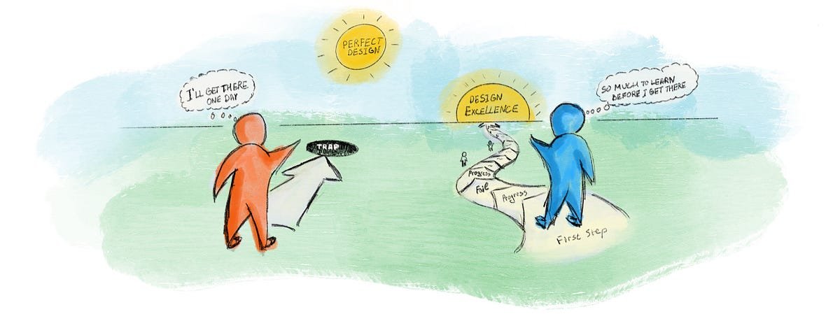
The Endless Loop of “Just One More Change”
In my early years as a UX designer, Something I used to struggle with was knowing when to stop working on a design. I often went through many iterations and polishing rounds because it still didn’t feel “finished.”
Eventually, I realized the problem wasn’t with the design — it was with not having a clear definition of what “done” actually meant.
The Real Problem: UX Has No Clear Finish Line
In UX, the definition of done is fuzzy.
Unlike development — where done means the code runs, tests pass, and the feature is delivered — UX lacks that sharp boundary.
Designers often mistake done for perfect, which leads to endless revisions and polishing rounds that don’t necessarily add value.
When there’s no clear definition of done, several issues start to appear:
Teams waste project time debating tiny visual details instead of moving forward.
There’s a risk of losing sight of the main objectives and drifting into details that don’t support the bigger purpose.
Without clarity, progress becomes slow, subjective, and misaligned.
What a Clear Definition of Done Should Include?
So what does a clear and practical definition of done actually look like in UX?
The design directly solves a real user need or pain point.
The core interaction should help users achieve their goal without confusion or unnecessary steps.The solution aligns with the project’s strategic objectives (business + user value).
A design can look beautiful, but if it doesn’t support the bigger purpose, it isn’t truly “done.”
These two criteria form the foundation. Everything else — colors, animations, illustrations, micro-copy flourishes — are layers of refinement. They matter, of course; polish enhances trust, usability, and overall delight. But polish should be added after the core objectives are achieved, not before.
However, refinement doesn’t mean “unnecessary.”
In some flows, creative design is essential. For example:
Onboarding
Activation moments
Educational or tutorial flows
Here, emotion, visual engagement, and creativity are part of the objective, because they help guide, reassure, and motivate users. In these contexts, delight is a design requirement.
But in other flows — such as settings, account management, or dense productivity tasks — creativity is not a core goal. Simplicity, clarity, and speed matter far more than visual flourishes.
A clear definition of done helps teams distinguish between:
Creative elements that serve the goal, and
Creative elements that distract from it
It keeps everyone anchored on what truly moves the product forward, prevents scope creep, and reduces emotional debates about unnecessary “nice-to-haves.”
In Practice: How “Done” Keeps Empty States Simple and Effective
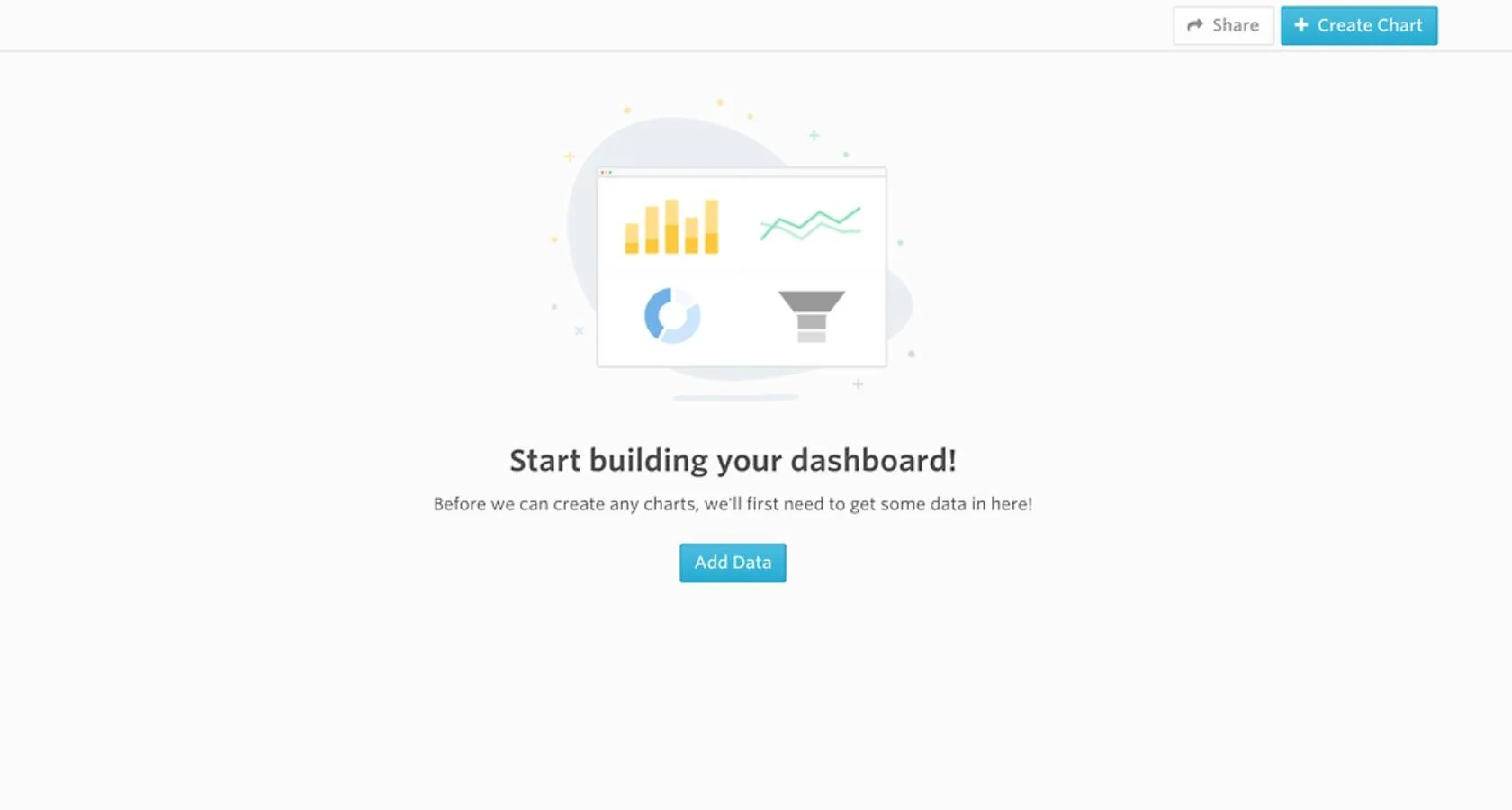
When you look at the empty state in the image above, you’ll notice how minimal it is: a simple illustration, a clear headline, a short explanation, and one primary call-to-action — “Add Data.”
This is a great example of how an empty state can be done without being overloaded. It guides the user, explains what’s happening, and points them toward the next step. It doesn’t try to entertain, over-explain, or visually impress. It simply helps the user move forward.
The main objectives of an empty state are to:
Explain why the screen is empty
Guide the user to the next action
Reassure them that the app is functioning
But teams often start adding:
Witty or creative copy
Animations and visual effects
These additions can add delight, but they’re not the main objective — and they can even become distractions, pulling attention away from the essential message.
Without a clear definition of done, something functional and simple can easily spiral into scope creep.
Conclusion: Clarity Helps Designers Move Forward with Confidence
Defining done in UX isn’t about lowering standards — it’s about focusing on the essential objectives and recognizing when those objectives are met.
A clear definition of done brings alignment, prevents overthinking, protects timelines, and helps designers move forward with confidence.