Game UX/UI Design
Redesign the Social Panel of the Sandbox
Client
The Sandbox
Role
Lead Product Designer
Year
2024
Duration
45 days

Overview
The Sandbox metaverse game offers a dynamic virtual world where players can create, explore, and interact within a fully customizable environment. The social panel is central to the multiplayer experience — but poor notification visibility, limited accessibility, and overall usability problems were reducing player engagement with social features.
Results after redesign
29%
Drop-off rate
4.2/5
User satisfaction score
27 min
Avg. notification response
Problem
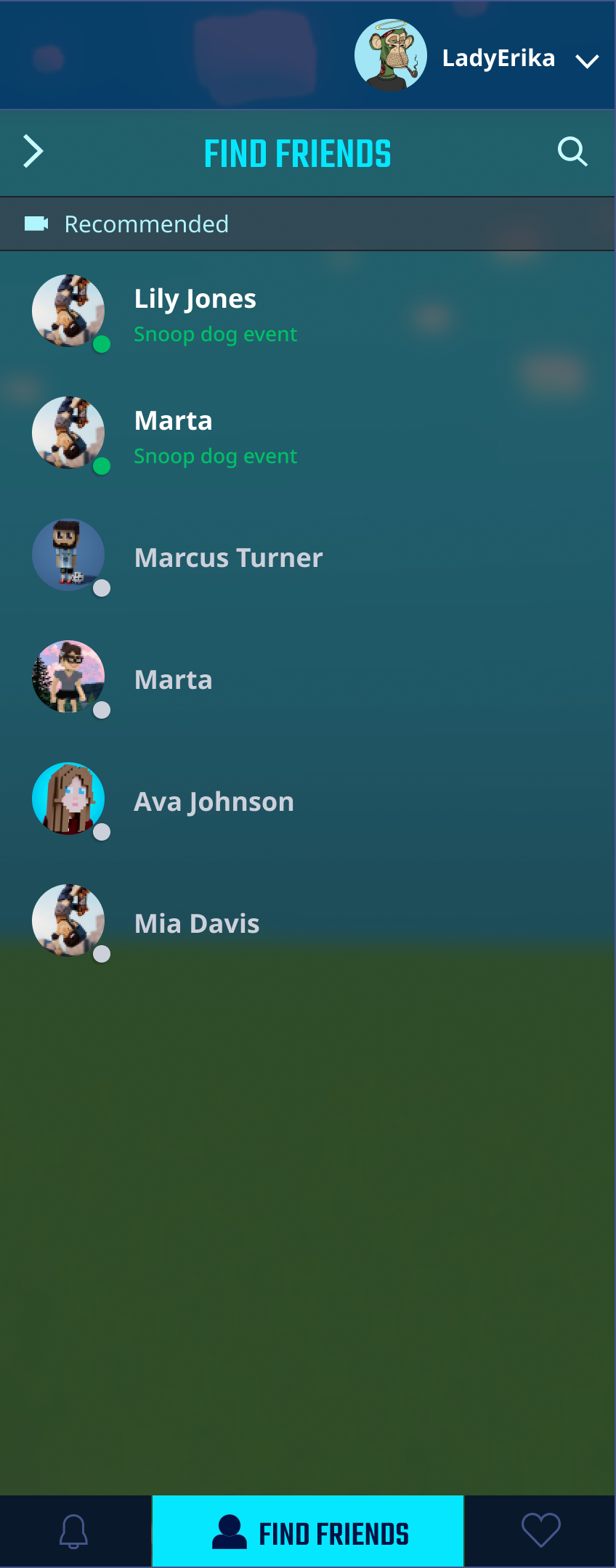
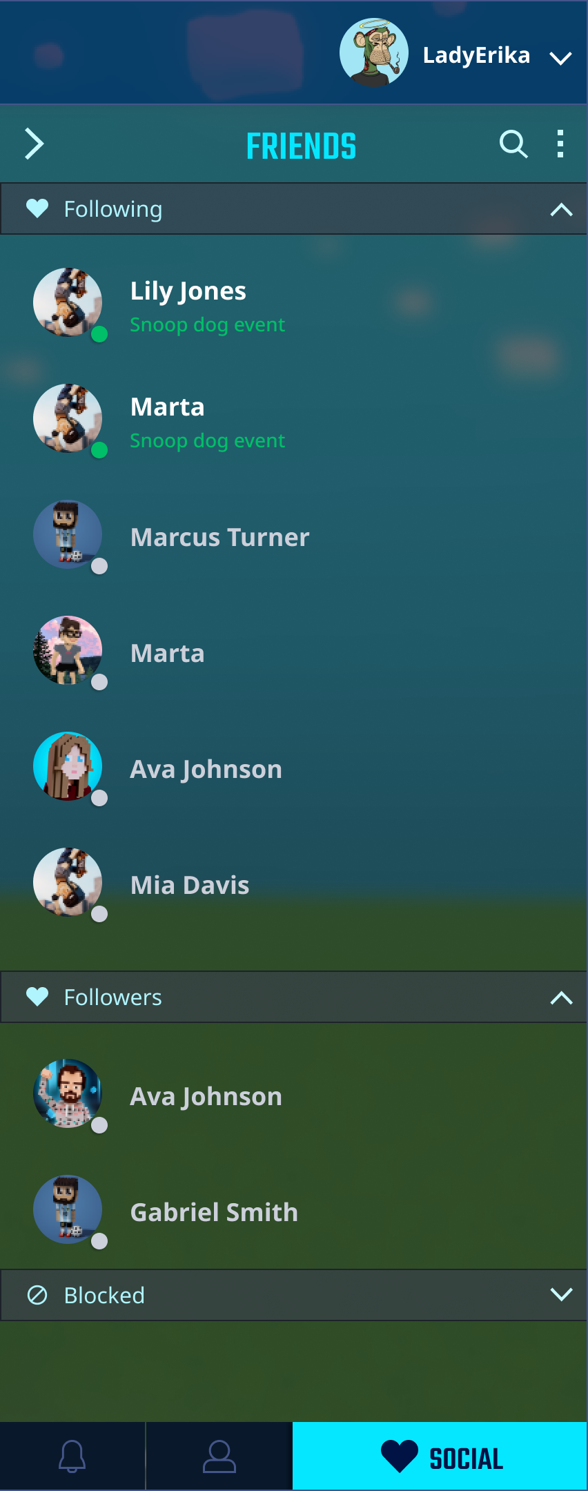
The social panel consisted of six core components: People You Follow, Followers, Blocked Users, Suggested Friends, Add Friends, and Notifications. Despite its importance, players were consistently missing social interactions and disengaging from the feature entirely.
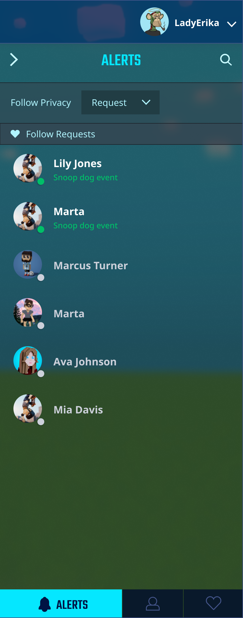
Poor notification visibility
Players were missing important social notifications, leading to reduced engagement with friends and multiplayer events.
Limited accessibility
The social panel was difficult to access, with the entry point buried in the interface and hard to discover during gameplay.
Usability issues
The accordion navigation pattern was slow to use and created friction when switching between user categories.
Research
Conducted 6 user interviews and a survey with 83 respondents to understand how players were interacting with the social panel. Competitor analysis covered Fall Guys, Fortnite, and ARK: Survival Evolved.
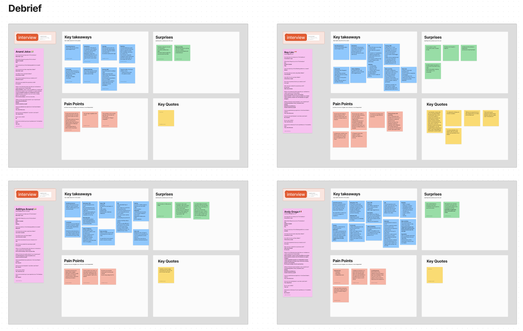
Fig. 1 — User research synthesis
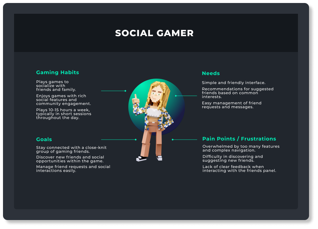
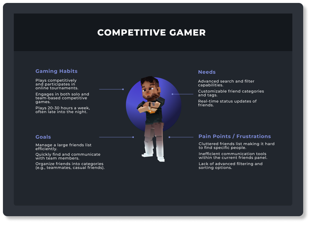
Fig. 2 — User personas
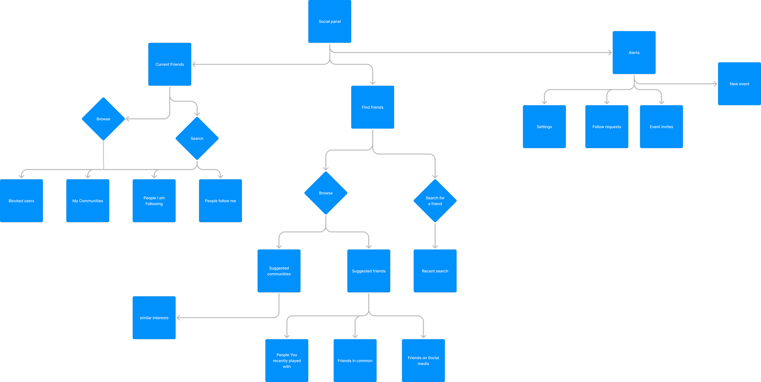
Fig. 3 — Information architecture
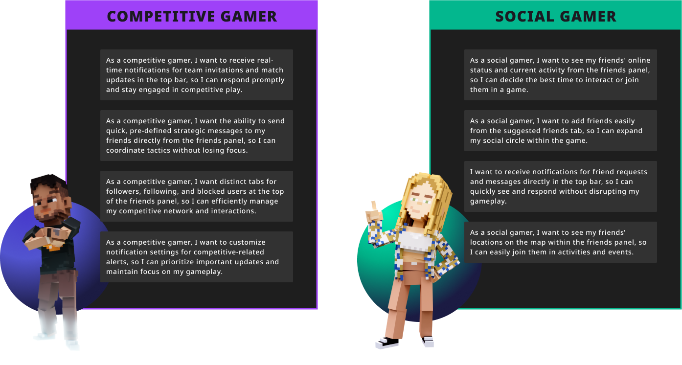
Fig. 4 — User stories
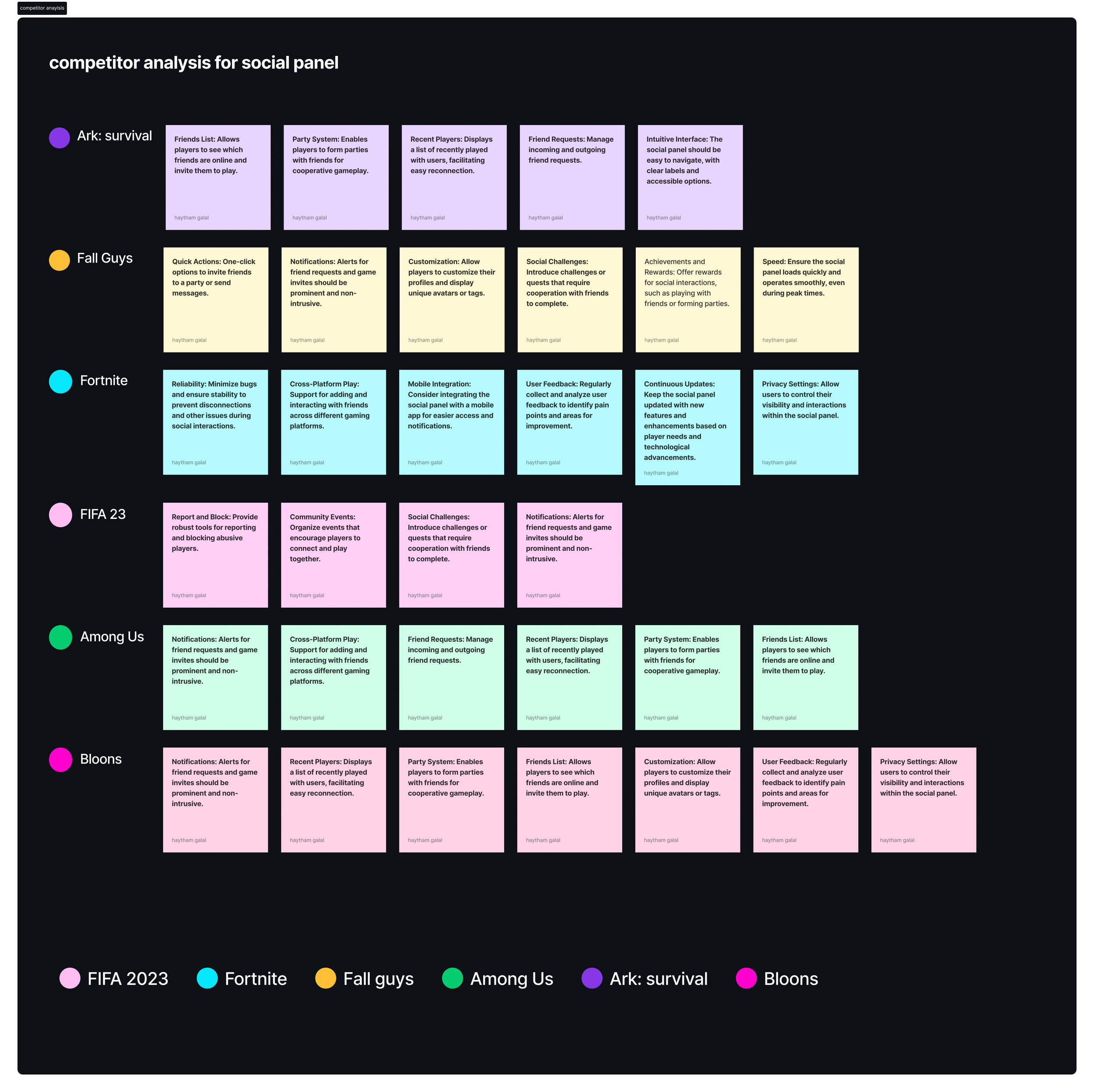
Fig. 5 — Competitor analysis
Design
Starting from wireframes and progressing through four rounds of iteration, four key improvements were identified and validated through usability testing.
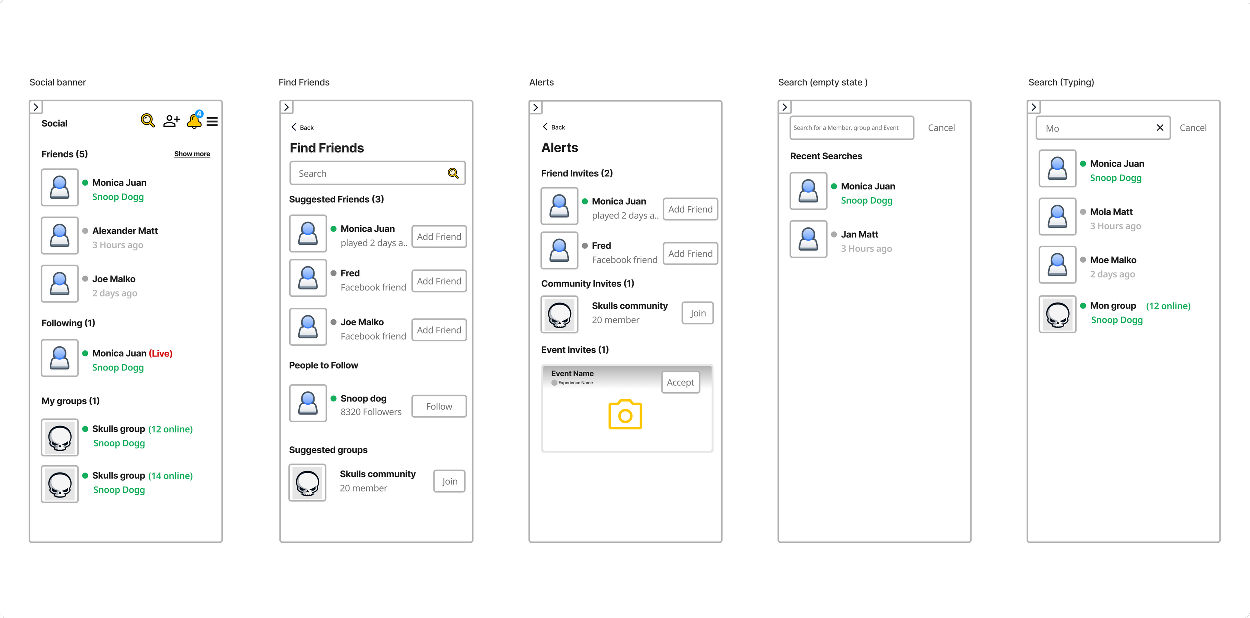
Fig. 8 — Wireframe flows, early iteration
Improvement 1
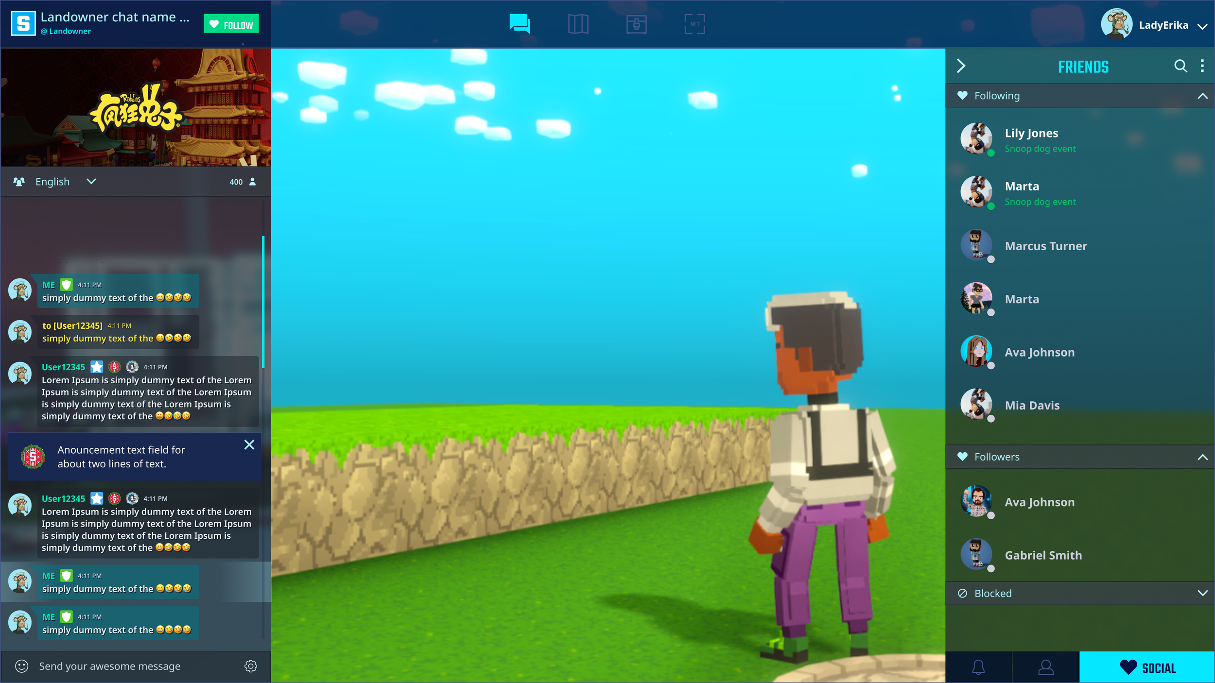
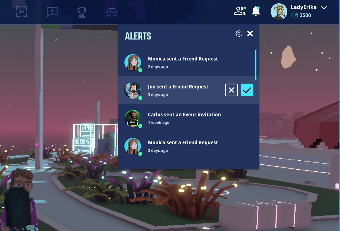
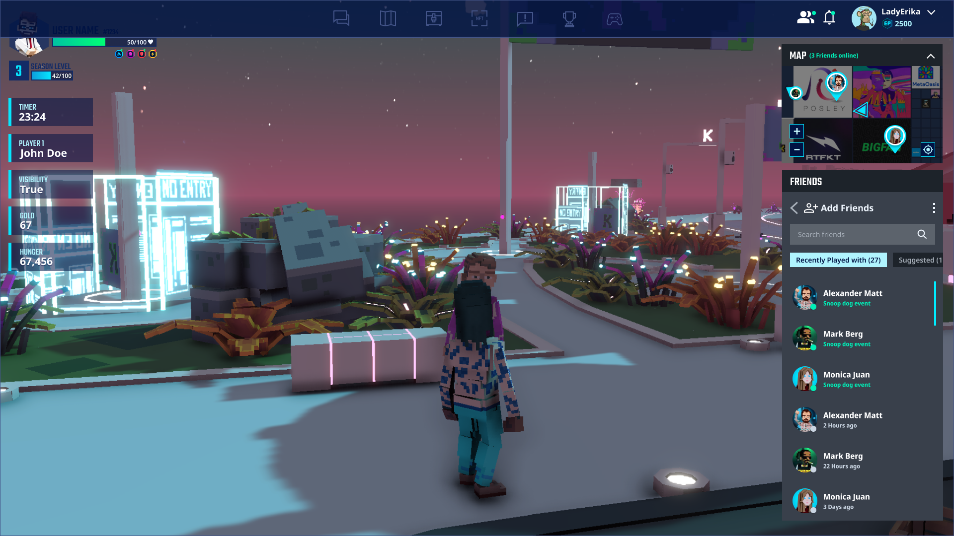
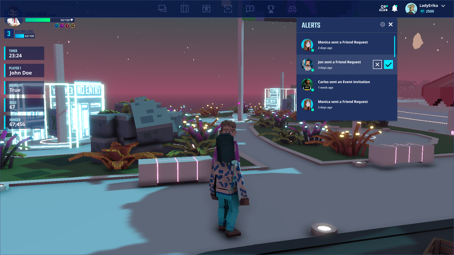
Relocating notifications to the top bar
Moving notifications to a persistent top bar position increased visibility and ensured players could see social activity without opening the panel.
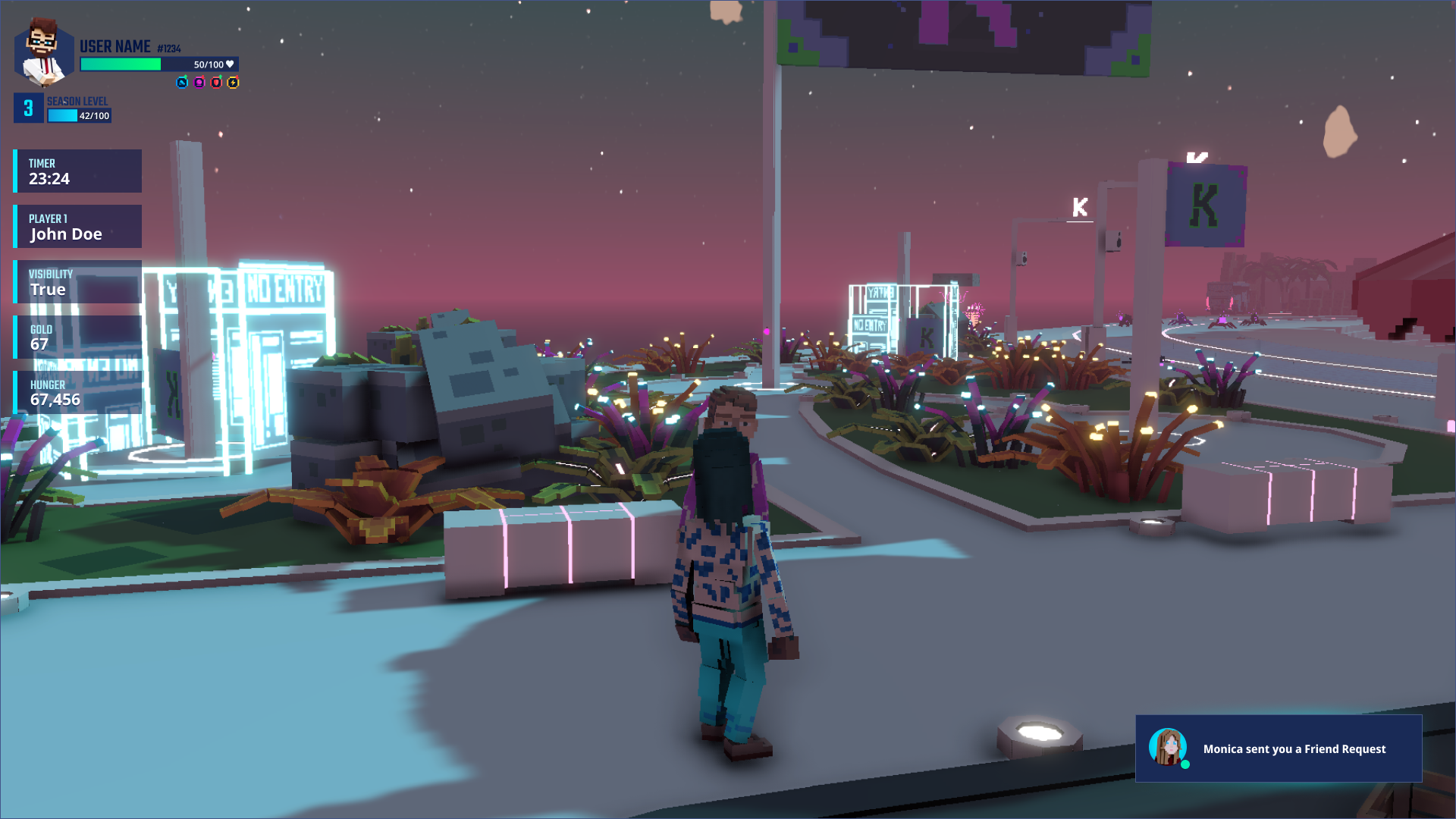
Before
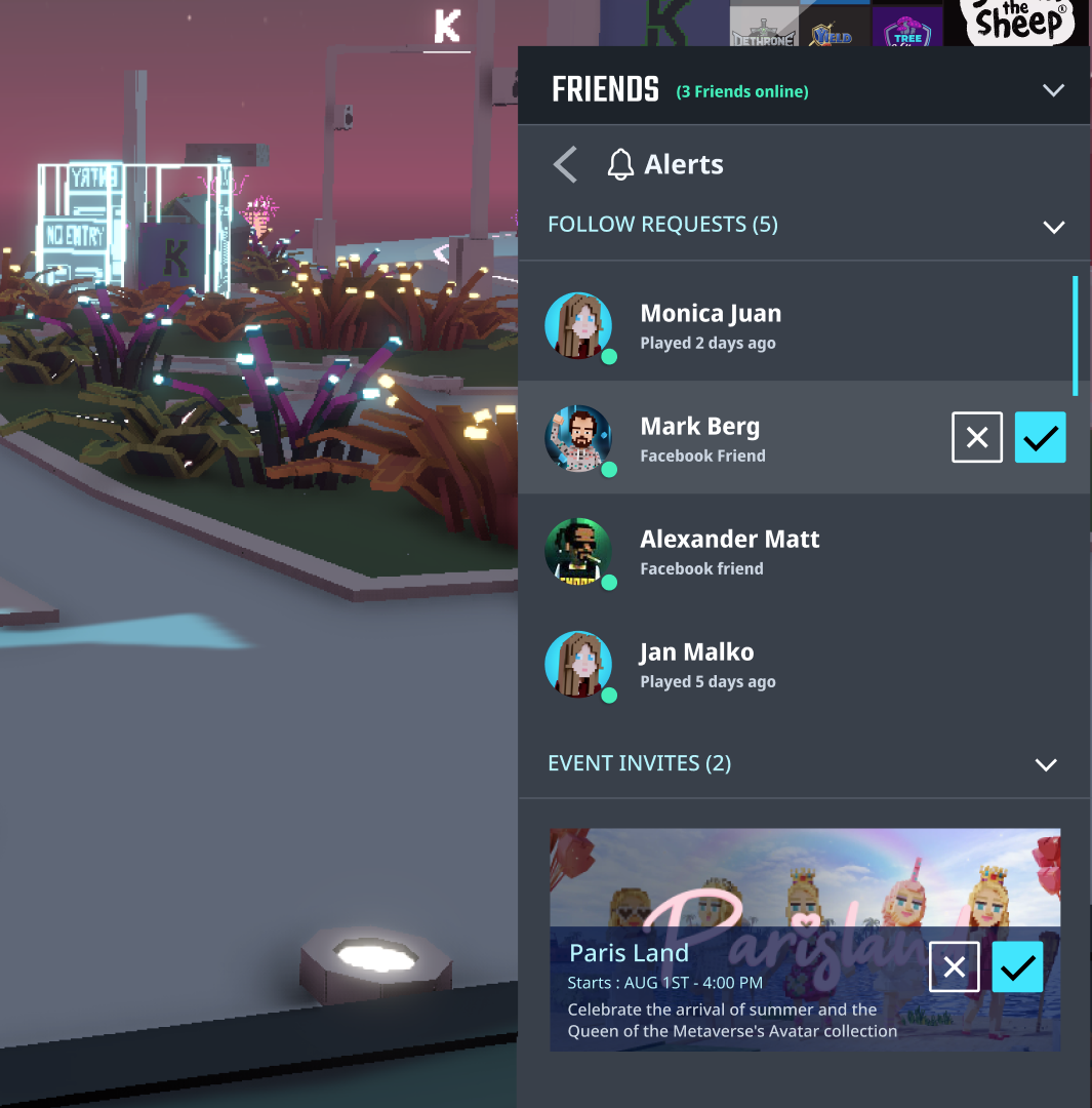
After
Improvement 2
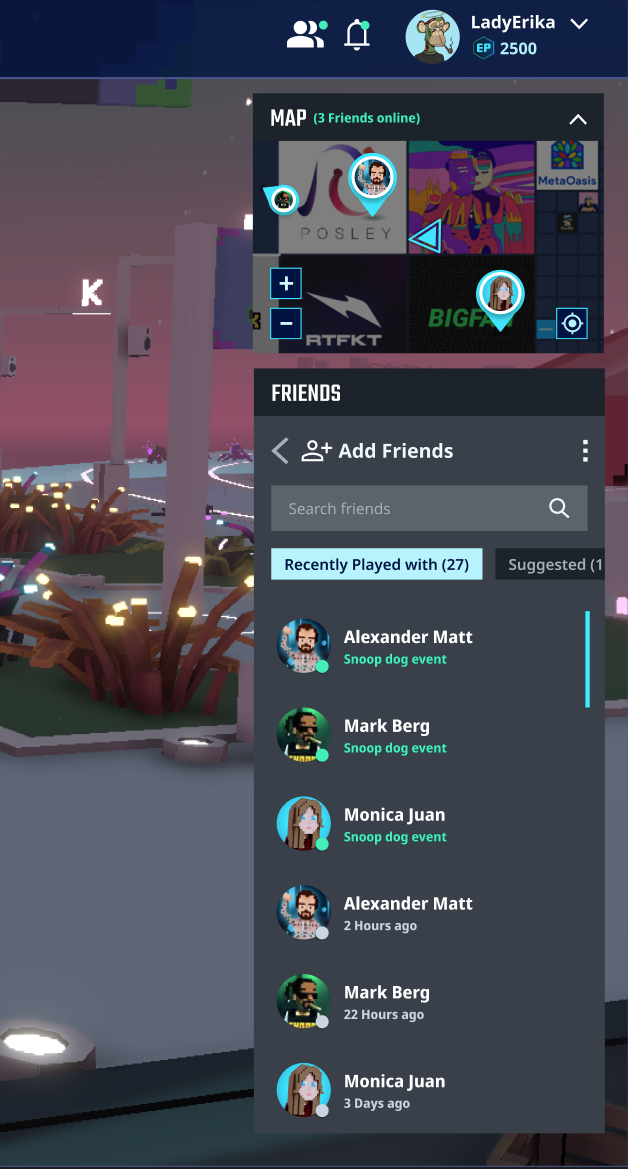
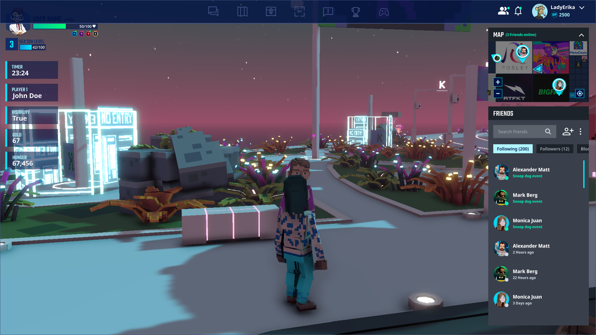
Tab navigation instead of accordion
Replacing the accordion pattern with tab-based navigation reduced the steps required to switch between user categories and improved scanning speed.
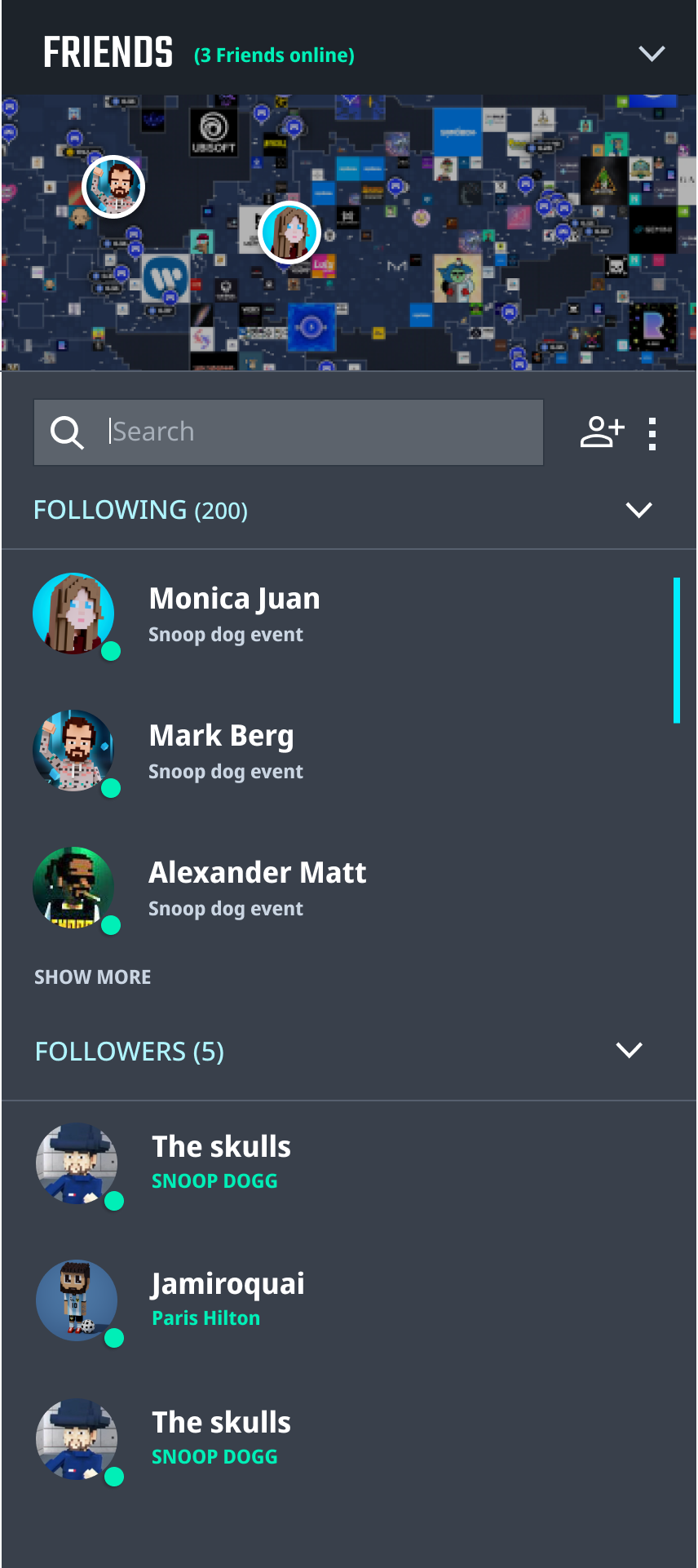
Before
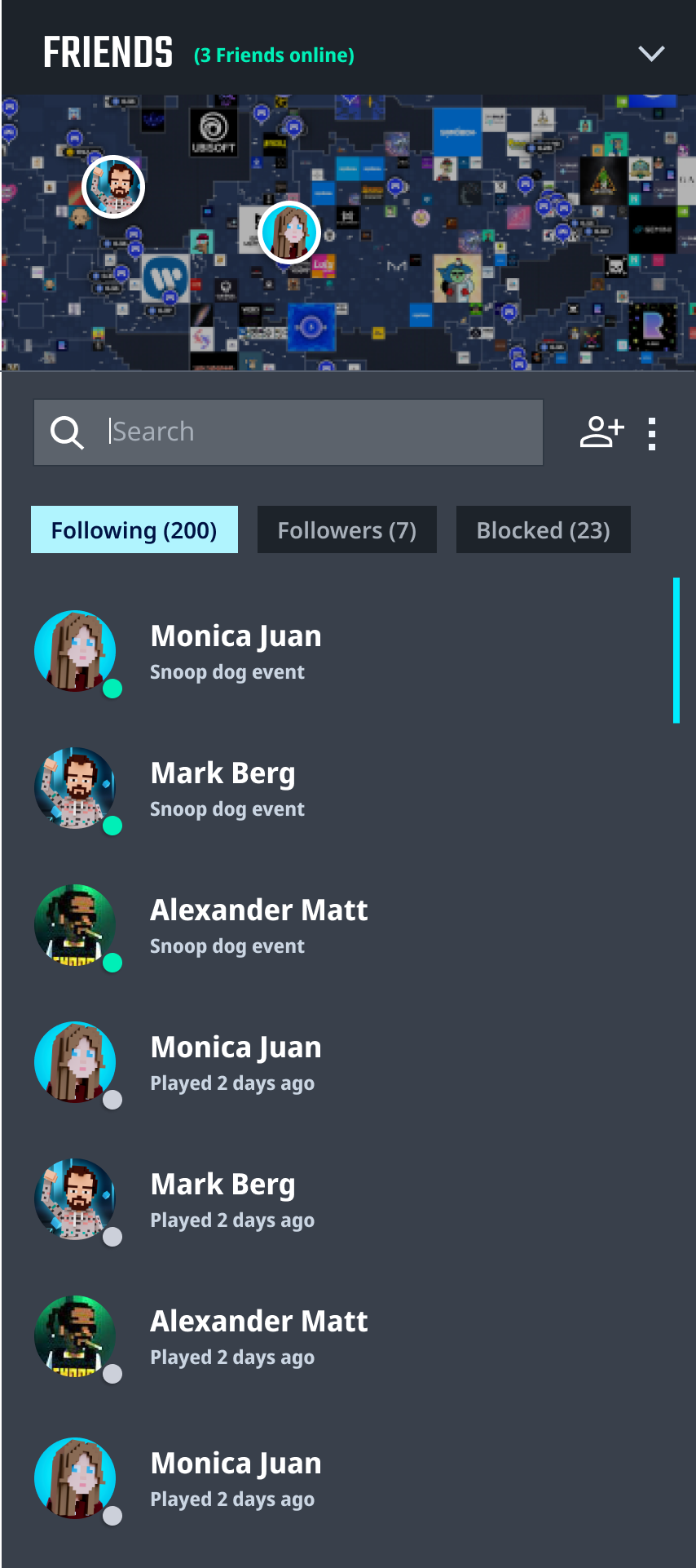
After
Improvement 3
Moving the panel access point to the top bar
Surfacing the social panel entry point in the top bar made it consistently accessible during gameplay without interrupting the player's flow.
Before
After
Improvement 4
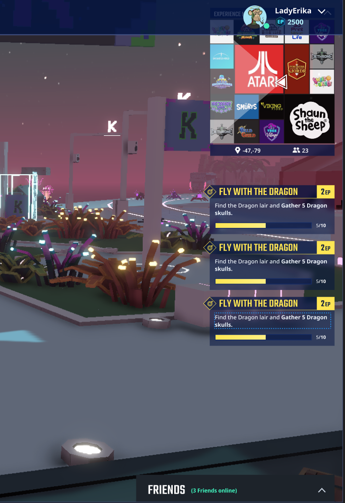
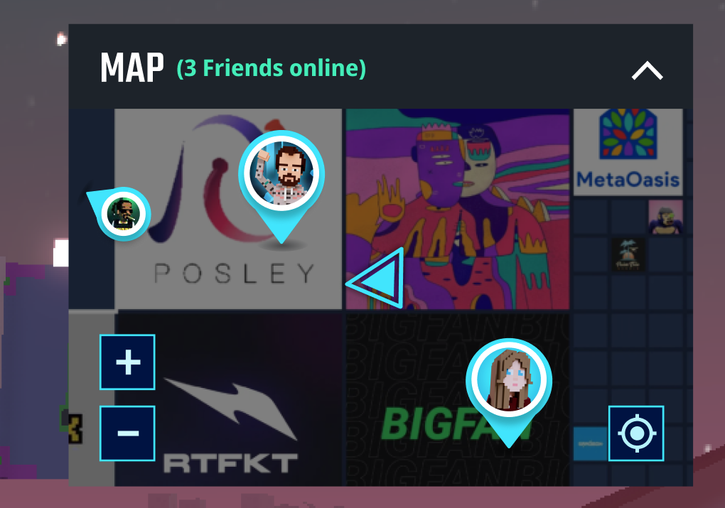
Minimap integration for friend location tracking
Integrating a minimap inside the social panel allowed players to see where their friends were in the world, directly bridging social and spatial awareness.
Before
Final Design
Add Friends

Outcome
The redesign delivered measurable improvements across all three problem areas. Drop-off rate decreased to 29%, user satisfaction improved to 4.2/5, and average notification response time was reduced to 27 minutes — all within a 45-day timeline.
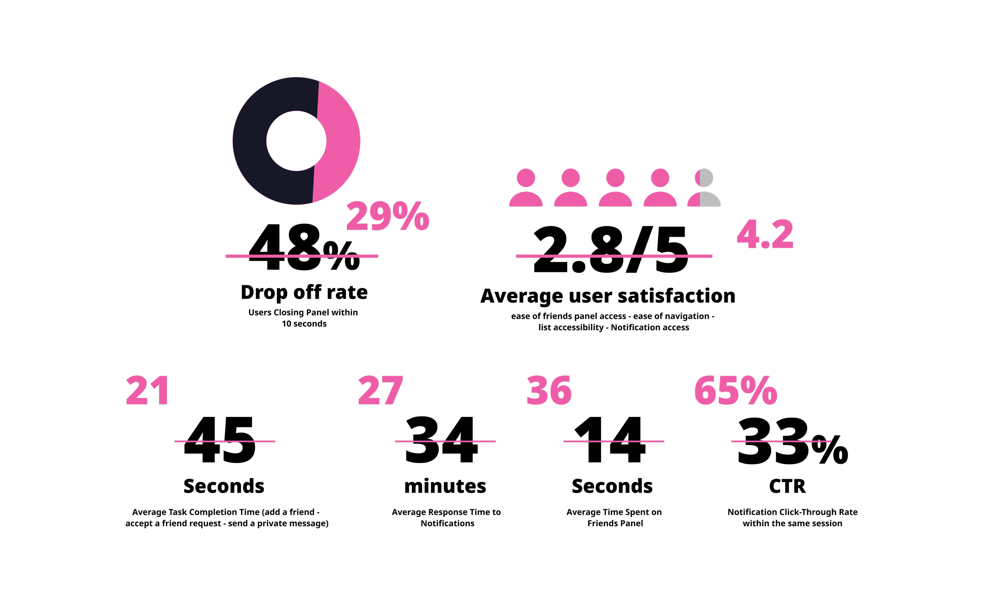
Fig. 9 — Results overview
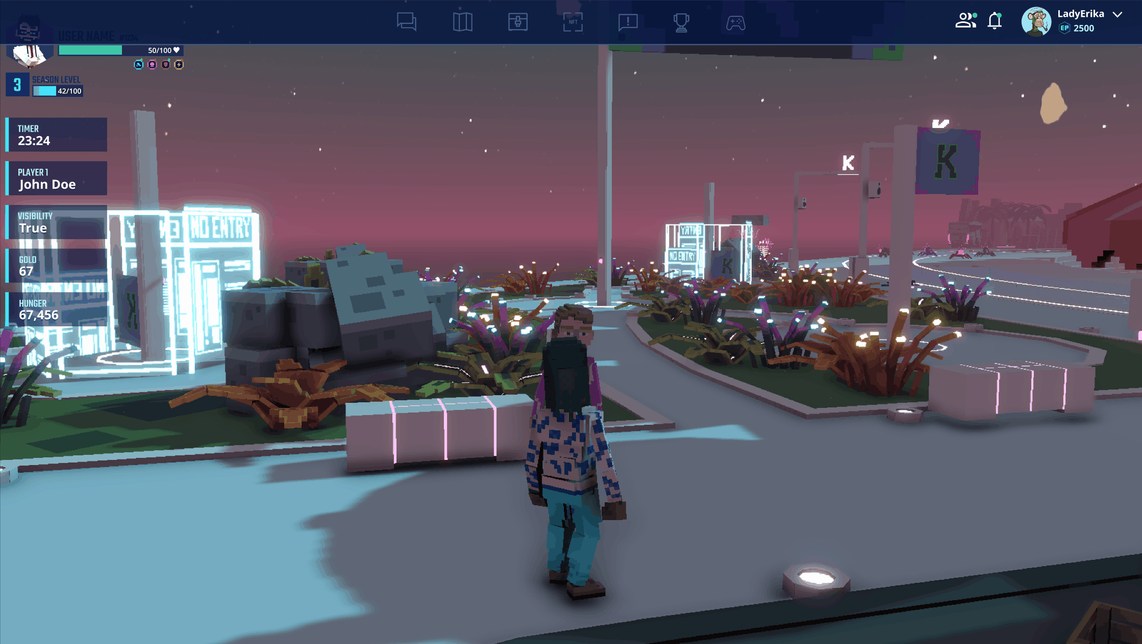
Fig. 10 — Prototype in action